Catalyst Gen brand.
Everything needed to represent Catalyst Gen consistently and accurately — the marks, the palette, the type, and what to call us.
Logo
The horizontal lockup is the default and should be used wherever it fits. The monogram exists for spaces the lockup cannot survive — avatars, favicons and app icons.
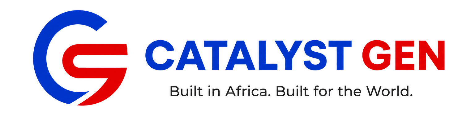

Leave free space around the lockup equal to the height of the C on all four sides. Nothing crosses it.
140px wide on screen, 30mm in print. Below that the strapline stops being legible — use the monogram instead.
Both marks are drawn on white. On navy, on blue or over a photograph, keep that plate and round it to 10px — do not knock the mark out or recolour it to sit flush.
Don't
The mark carries the company's only visual equity. These are the five things that spend it.
- Recolour the logo, or apply gradients, shadows or outlines to it.
- Stretch, rotate, crop or otherwise redraw the proportions of the lockup.
- Place the light lockup on a busy photograph, or on a mid-tone that starves it of contrast.
- Rebuild the wordmark by setting CATALYST GEN in Inter — the letterforms are drawn, not typed.
- Use the monogram where the full lockup fits. It is for spaces the lockup cannot survive.
Colour
Blue carries the brand and red interrupts it. Red is never a surface colour — it appears as a rule, a marker or a dot, and it stops meaning anything the moment it covers an area.
Typography
Inter, at four steps and nothing in between. Headings run tight and slightly negative; body copy runs open. The micro-label is the only place letters are spaced apart.
AaBbCcDdEeFfGgHhIiJjKkLlMmNnOoPpQqRrSsTtUuVvWwXxYyZz 0123456789
Built in Africa.
We build products that solve real problems.
Every product we build turns something people do informally into structure a system can act on.
Our point of view
Name
Refer to us as Catalyst Gen. The product names are set the way their own teams set them.
Need a format that isn't here, or a review before you publish? Email info@catalystgen.net.